Arlo Accountancy
REBRAND | BRAND GUIDELINES | STATIONERY | DESIGN FOR PRINT | SOCIAL MEDIA
Arlo Accountancy are a chartered accountants based in Stockport, Manchester. As the businesses 5th anniversary approached, owner Adrian decided it was time to set the growing business apart from its competitors by rebranding Arlo.
Stanhope Design was commissioned to work on all aspects of the rebrand from the logo design, colour palette, brand guidelines, a 5th anniversary graphic for social media along with a suite of stationery including business cards, letterhead and compliment slip for his growing team of staff to use.
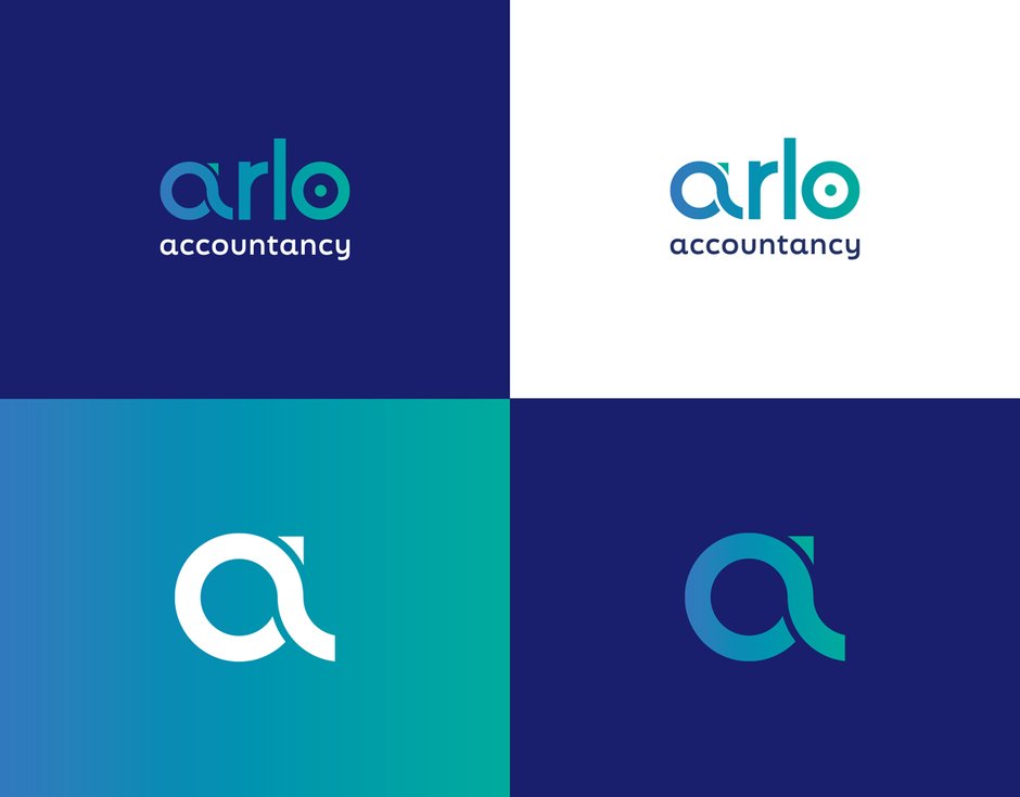
The logo design chosen by Adrian and the team has been crafted from a series of curves taken from a circle. The lower-case letter ‘a’ symbolises a journey, with the top of the letter ‘a’ forming an upwards facing arrow suggestive of positivity. This letter ‘a’ can be used as a stand alone icon to support the main logo. The letter ‘o’ features a dot within the centre representing a target and focus. Overall the look and feel is clean, professional, trustworthy and modern, instilling confidence in clients and potential new customers.
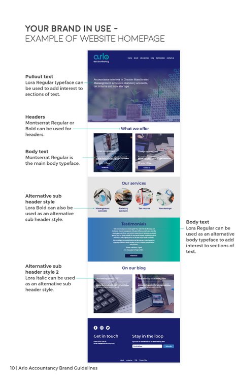
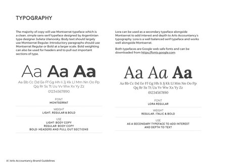
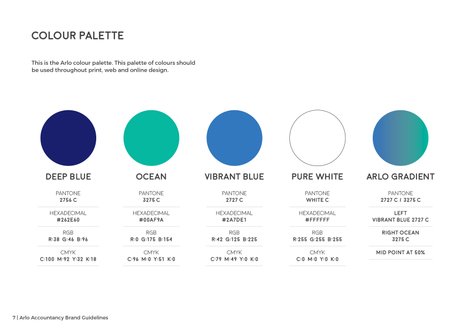
Adrian at Arlo saw the importance of carrying the brand through all aspects of the business. The brand guidelines document that has been put together by Stanhope Design aids use of the brand in the correct manner. The document details logo usage, colour palette, typography, provides an example of how the brand could be carried across onto the website, as well as social media styling.
Brand guidelines for Arlo Accountancy
Social media graphics for Arlo Accountancy.


